
Lesson 4: Creating Charts
In Microsoft Excel, you can represent numbers in a chart. On the Insert tab, you can choose from a variety of chart types, including column, line, pie, bar, area, and scatter. The basic procedure for creating a chart is the same no matter what type of chart you choose. As you change your data, your chart will automatically update.
You select a chart type by choosing an option from the Insert tab's Chart group. After you choose a chart type, such as column, line, or bar, you choose a chart sub-type. For example, after you choose Column Chart, you can choose to have your chart represented as a two-dimensional chart, a three-dimensional chart, a cylinder chart, a cone chart, or a pyramid chart. There are further sub-types within each of these categories. As you roll your mouse pointer over each option, Excel supplies a brief description of each chart sub-type.
Create a Chart
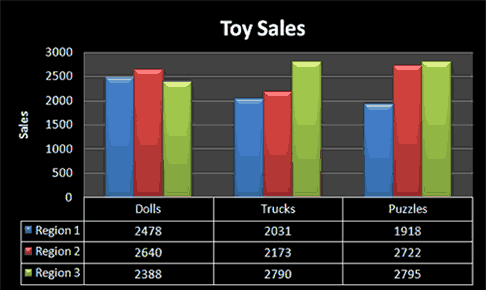
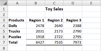
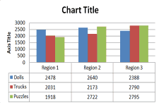
To create the column chart shown above, start by creating the worksheet below exactly as shown.
After you have created the worksheet, you are ready to create your chart.
EXERCISE 1
Create a Column Chart
.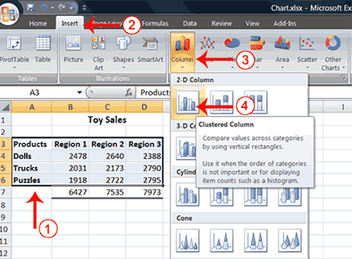
- Select cells A3 to D6. You must select all the cells containing the data you want in your chart. You should also include the data labels.
- Choose the Insert tab.
- Click the Column button in the Charts group. A list of column chart sub-types types appears.
- Click the Clustered Column chart sub-type. Excel creates a Clustered Column chart and the Chart Tools context tabs appear.
Apply a Chart Layout
Context tabs are tabs that only appear when you need them. Called Chart Tools, there are three chart context tabs: Design, Layout, and Format. The tabs become available when you create a new chart or when you click on a chart. You can use these tabs to customize your chart.
You can determine what your chart displays by choosing a layout. For example, the layout you choose determines whether your chart displays a title, where the title displays, whether your chart has a legend, where the legend displays, whether the chart has axis labels and so on. Excel provides several layouts from which you can choose.
EXERCISE 2
Apply a Chart Layout
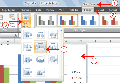
- Click your chart. The Chart Tools become available.
- Choose the Design tab.
- Click the Quick Layout button in the Chart Layout group. A list of chart layouts appears.
- Click Layout 5. Excel applies the layout to your chart.
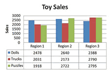
Add Labels
When you apply a layout, Excel may create areas where you can insert labels. You use labels to give your chart a title or to label your axes. When you applied layout 5, Excel created label areas for a title and for the vertical axis.
EXERCISE 3
Add labels
 |
Before |
 |
After |
- Select Chart Title. Click on Chart Title and then place your cursor before the C in Chart and hold down the Shift key while you use the right arrow key to highlight the words Chart Title.
- Type Toy Sales. Excel adds your title.
- Select Axis Title. Click on Axis Title. Place your cursor before the A in Axis. Hold down the Shift key while you use the right arrow key to highlight the words Axis Title.
- Type Sales. Excel labels the axis.
- Click anywhere on the chart to end your entry.
Switch Data
If you want to change what displays in your chart, you can switch from row data to column data and vice versa.
EXERCISE 4
Switch Data
 |
Before |
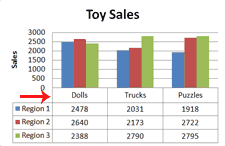 |
After |
- Click your chart. The Chart Tools become available.
- Choose the Design tab.
- Click the Switch Row/Column button in the Data group. Excel changes the data in your chart.
Change the Style of a Chart
A style is a set of formatting options. You can use a style to change the color and format of your chart. Excel 2007 has several predefined styles that you can use. They are numbered from left to right, starting with 1, which is located in the upper-left corner.
EXERCISE 5
Change the Style of a Chart
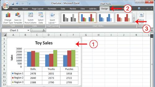
- Click your chart. The Chart Tools become available.
- Choose the Design tab.
- Click the More button
 in the Chart Styles group. The chart styles appear.
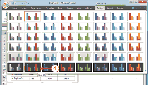
- Click Style 42. Excel applies the style to your chart.
Change the Size and Position of a Chart
When you click a chart, handles appear on the right and left sides, the top and bottom, and the corners of the chart. You can drag the handles on the top and bottom of the chart to increase or decrease the height of the chart. You can drag the handles on the left and right sides to increase or decrease the width of the chart. You can drag the handles on the corners to increase or decrease the size of the chart proportionally. You can change the position of a chart by clicking on an unused area of the chart and dragging.
EXERCISE 6
Change the Size and Position of a Chart
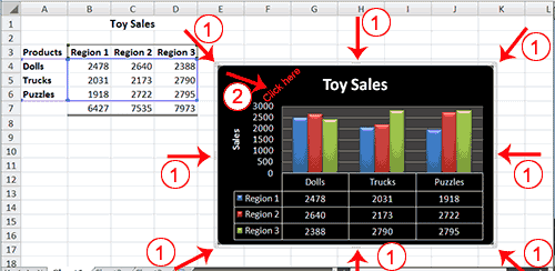
- Use the handles to adjust the size of your chart.
- Click an unused portion of the chart and drag to position the chart beside the data.
Move a Chart to a Chart Sheet
By default, when you create a chart, Excel embeds the chart in the active worksheet. However, you can move a chart to another worksheet or to a chart sheet. A chart sheet is a sheet dedicated to a particular chart. By default Excel names each chart sheet sequentially, starting with Chart1. You can change the name.
EXERCISE 7
Move a Chart to a Chart Sheet
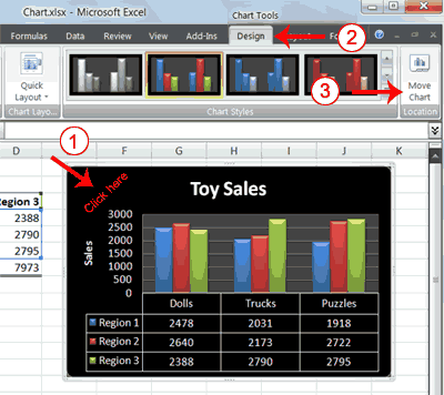
- Click your chart. The Chart Tools become available.
- Choose the Design tab.
- Click the Move Chart button in the Location group. The Move Chart dialog box appears.
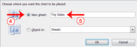
- Click the New Sheet radio button.
- Type Toy Sales to name the chart sheet. Excel creates a chart sheet named Toy Sales and places your chart on it.
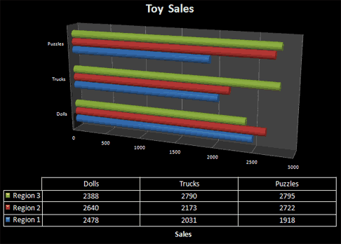
Change the Chart Type
Any change you can make to a chart that is embedded in a worksheet, you can also make to a chart sheet. For example, you can change the chart type from a column chart to a bar chart.
EXERCISE 8
Change the Chart Type
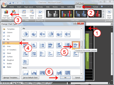
- Click your chart. The Chart Tools become available.
- Choose the Design tab.
- Click Change Chart Type in the Type group. The Chart Type dialog box appears.
- Click Bar.
- Click Clustered Horizontal Cylinder.
- Click OK. Excel changes your chart type.
You have reached the end of Lesson 4. You can save and close your file.