
Lesson 4: Creating Charts
Using Microsoft Excel, you can represent numbers in a chart. You can choose from a variety of chart types. And, as you change your data, your chart will automatically update. You can use Microsoft Excel's Chart Wizard to take you through the process step-by-step.
Creating a Column Chart
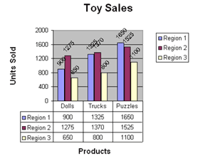
To create the column chart shown above, start by creating the spreadsheet below exactly as shown.
After you have created the spreadsheet, you are ready to create your chart.
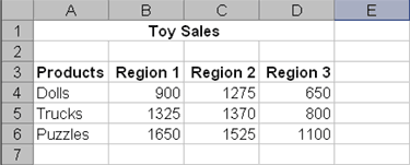
- Highlight cells A3 to D6. You must highlight all the cells containing the data you want in your chart. You should also include the data labels.
- Choose Insert > Chart from the menu.
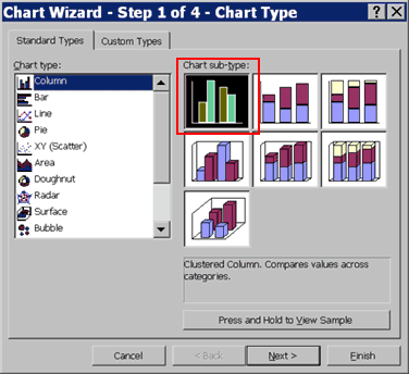
- Click Column to select the type of chart you want to create.
- In the Chart Sub-type box, choose the Clustered Column icon to select the chart sub-type.
- Click Next.
- To place the product names on the x-axis, select the Columns radio button.
- Click Next.
- Type Toy Sales in the Chart Title field. Toy Sales will appear as the title of your chart.
- Type Products in the Category (X) Axis field. Products will appear as your x-axis title.
- Type Units Sold in the Value (Y) Axis field. Units Sold will appear as your y-axis title.
- Choose the Data Labels tab.
- Select Value in the Labels Contain Frame to display the data labels as values.
- Choose the Data Table tab.
- Select Show Data Table. The data table will appear below your chart.
- Click Next.
- Choose As Object In Sheet1 to make your chart an embedded object and part of the worksheet.
- Click Finish
- Your chart will appear on the spreadsheet.
Changing the Size and Position of a Chart
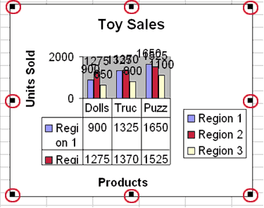
When you select a chart, handles appear on the right and left sides, the top and bottom, and the corners of the chart. You can drag the handles on the top and bottom of the chart to increase or decrease the height of the chart. You can drag the handles on the left and right sides of the chart to increase or decrease the width of the chart. You can drag the handles on the corners of the chart to increase or decrease the size of the chart proportionally.
You can change the position of a chart by clicking on the chart and dragging
- Use the handles to adjust the size of your chart.
- Click the chart and drag to position the chart under the data.
Modify
Your Chart
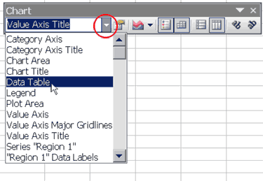
You can modify your chart by using the Chart toolbar. If the Chart toolbar is not already available, choose View > Toolbars > Chart from the menu.
![]()
Chart Toolbar
To change the data area font size:
- Click the down arrow on the Chart toolbar. A drop-down menu opens.
- Choose Data Table from the drop-down menu.
- Click the Options icon
 .
Choose the Font tab.
.
Choose the Font tab. - In the Size box, type 8.
- Click OK. Your font size is now 8.
To change the angle of the data labels:
- Click the down arrow on the Chart toolbar. A drop-down menu opens.
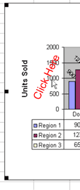
- Choose "Region 1" Data Labels from the drop-down menu.
- Click the Angle Counter Clockwise icon
 .
The Region 1 Data Labels are angled counter-clockwise.
.
The Region 1 Data Labels are angled counter-clockwise. - Repeat this process for Regions 2 and 3.
To change the font size of the Region data labels:
- Click the down arrow on the Chart toolbar. A drop-down menu opens.
- Choose "Region 1" Data Labels from the drop-down menu.
- Click the Options icon. Choose the Font tab.
- In the Size box, type 6.
- Click OK. Your font size is now 6.
- Repeat this process for Region 2 and 3.
You can also make changes by double-clicking on the item you want to change.
To change the chart scale:
- Double-click on the scale. The Format Axis dialog box opens.
- Choose the Scale tab.
- Type 400 in the Major Unit field.
- Click OK. Your chart is now scaled in units of 400.
Saving Your File
To save your file:
- Choose File>Save from the menu.
- Go to the directory in which you want to save your file.
- Type lesson4 in the File Name field.
- Click Save.
Closing Microsoft Excel
This is the end of Lesson 4. Close Microsoft Excel.
- Choose File > Exit from the menu.